Time for part 3 of my blogging tips posts where I’m doing some quick, easy tips on branding for your blog!
This week I’m talking about getting the look of your blog right, specifically getting consistency to your logo (header) and images wherever they’re seen – be that on your blog, pinned on Pinterest or featured on external sites. That tip is:
#3 CHOOSE JUST 1 (OR 2) FONTS.
Very rarely does a font work for both your header and your body text, so I’m excluding the font you use for your post content. I’m talking about the font(s) you use for your header, your sidebar and the overlay you use on images – especially the ones used for “how-to” or round up posts. Like the lead image on this actual post (above), for example.
What’s the benefit of using just 1 or 2 fonts?
It’s very simple – like using just one avatar across all your profiles and social media platforms, using one particular font gives a cohesive look to your blog (and therefore your brand). Sometimes a second font, like a handwritten one, is needed for contrast, but it needs to be exactly that – a contrast. Don’t choose two similar-ish fonts or it’ll look like a mistake, so go for variety. See 10 Beautiful Font Combinations For All Your Design Needs for some inspiration. A typeface should match the tone of its text, so keep this in mind when deciding what best represents your blog and your voice.
What font do I choose?
Choose something that’s easy to read (in both upper and lower case, if the font comes as both), that reflects the content of your blog and that expresses your personality. It’s a very personal choice, of course, and can sometimes be a case of trial and error. I would advise against using a very stylised font that’s widely recognised or one that’s been touted as a “fashionable” font, however. These are seen and used a lot – especially on blogs – so they won’t do anything to help brand your blog and make it stand out (Lobster is an example of an overused font on blogs).
As you will be using it for your header and on images (i.e. not for the body/text of your posts), it doesn’t have to be a font that can be “read” by other devices and computers.
[Please note that this post was written before I redesigned my blog, so the fonts have since changed… I will update this post in time, as I update all the images on these posts!]
Last year I finally found a font that suited my blog: a tall, clean font that I liked both as upper and lower case. It being narrow meant it would suit text overlay when there are a lot of words to fit in widthways. I used it for my blog header, in my sidebar for the category titles and for the musings/tips/how-to posts. I’ve also used it on my business cards and anywhere I have to create a button or banner:
You’ll see that there’s consistency between my header (above) and the lead images for my posts about blogging tips/musings/ways to wear, etc. (below).
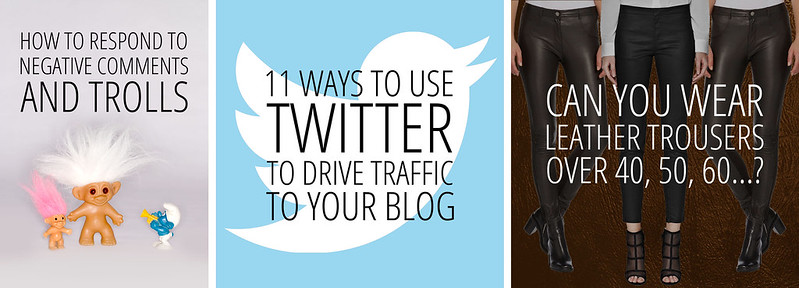
L-R: posts about Trolls | Twitter | Leather trousers
One final thing to say about choosing a font: never, ever, EVER choose Comic Sans. On anything, ever. There’s a saying that you should never use Comic Sans unless you’re an 8 year-old girl writing a poem about unicorns – it’s the most unprofessional, most ridiculed font there is (there is even a “Ban Comic Sans” website). This is one rule to which there are NO exceptions…!
Does the layout of your fonts matter?
By also being consistent with your layout you’ll reinforce your branding further, whatever layout or format you choose. The layout that I usually go for is all the text the same width across to create a block of text, rather than using the same size font all the time. The combination of consistent font and layout is very strong visually and key to being recognised as a brand.
Where do I get free fonts?
Generally, if you know the name of a font you want to use you can Google “fontname free font” and usually find somewhere to download it for free. Do be careful about where you’re downloading it from, however – if there are lots of flashing pop ups or ads I’d avoid it at all costs. I have a lot of confidence in the following websites as I’ve downloaded fonts from all of them at some point or other:
The great thing about a lot of these sites is that you can type in a phrase – your blog name for example – and scroll through all the fonts seeing what your actual blog name looks like in each one, not just the name of the font in its own style (if that makes sense). 1001freefonts.com gave me these examples for Not Dressed As Lamb:
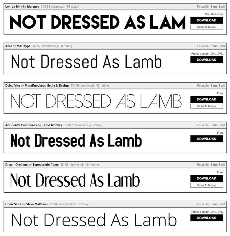
There are SO many fonts to choose from, it’s somewhat overwhelming if you’ve never searched one of these sites before. A good tip is to pick a style out of the different categories they give you, e.g. decorative, retro, handwritten, modern, rounded, sans serif, etc. that is suited to your personality – and that of your blog.
What does serif/sans serif mean…?
In typography, “serif” describes the little sticking-out lines attached to the end of the letters in a font, like Times New Roman or Georgia. Sans serif (“sans” meaning “without” in French) fonts don’t have the little lines so look cleaner and usually more minimalist, like Arial or Verdana.
What do I do about images on old posts with different fonts?
If you’re prepared to set aside some time to do this, it’s well worth the effort. You simply go back over any old posts (worthy of being reread and publicised again) that have text overlay and you redesign them with your new font and layout. Once I’d redesigned my blog header with my new font last year I did exactly that; every post was redesigned to fit in with my new look. The added bonus is that you can then pin all those posts again – they’ll look fresh and new and should bring you more traffic.
Can you give me some before and after examples?
Below are some before and afters of some of the posts that I went back over and completely re-branded. Some needed only the font changing, others needed a bit more… others needed a whole lot more in order to keep them all looking consistent and like they were instantly recognisable as Not Dressed As Lamb posts.
[Again, please note that this post was written before I redesigned my blog, so the fonts have since changed… I will update this post in time, as I update all the images on these posts]Hopefully you’ll see that all the ones down the right-hand side are consistent, whereas the ones down the left are all over the place font-wise (I obviously couldn’t make up my mind which one to use over the first three years).
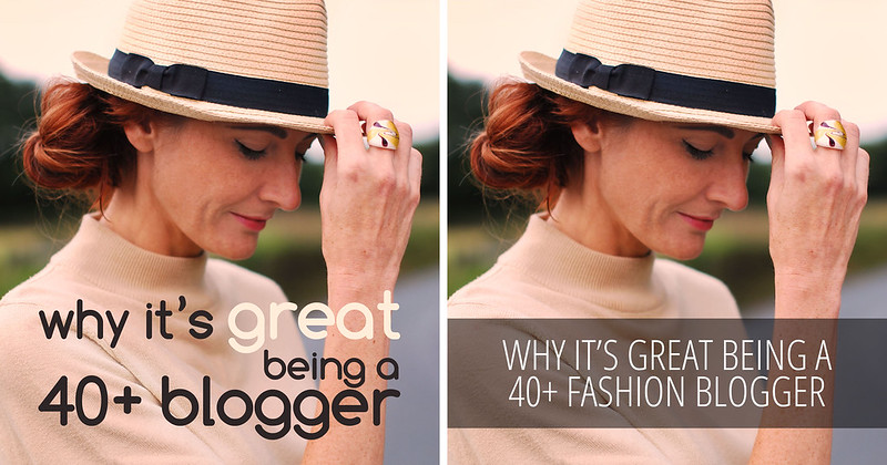
1. Although this post used the same font as the blog header I had at the time, it needed changing to match the new one. I also added a band to create a little contrast and make the text overlay stand out… neither black nor white was visible enough, hence the band. (original post)
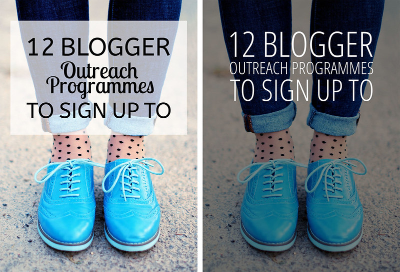
2. This post originally used two fonts that weren’t anything like my blog header font (I followed the crowd and used ‘fashionable’ fonts, like Lobster). I reversed the black font to white and instead of a box of transparent white, I made it transparent black instead and covered the whole image with it so that the emphasis would be on the text. (original post)
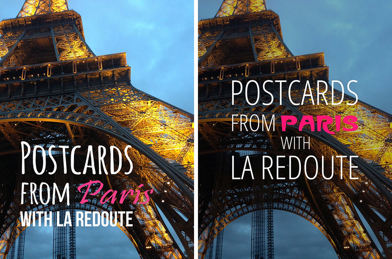
3. Bending the rules: Again I chose random fonts originally, but on the new version I wanted the word “Paris” to stand out so I chose the classic Paris Metro (underground) font. You don’t have to be strict about your fonts 100% of the time, but if there’s a logical reason for a particular font – as here – then don’t be afraid to experiment. (original post)
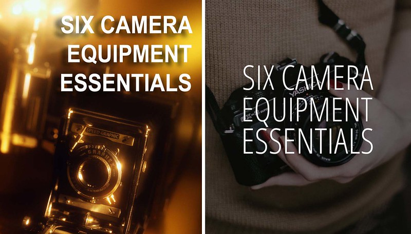
4. Not only did I change the font and its layout, but I decided to go for a completely new background image. The old one just wasn’t in keeping with the new look. (original post)
Aren’t these rules a bit strict – what if there are 3 or 4 fonts that I like?
These aren’t rules, they’re simply guidelines to go by if you’re in the dark about how to brand your blog. Plenty of bloggers break the maximum two fonts guide and it works brilliantly. All these tips are intended to help those who don’t know where to start, so they should give you an idea of what to do when it comes to deciding how best to brand yourself and your blog, if that’s what you want to do. As with everything it’s up to the individual, so go for 3+ fonts if you want – I’d still recommend sticking to those same fonts each time if you can though…!
Do you have a particular font that you always use? How did you choose which one to use? And if you don’t use just one font, are you convinced you should pick one and stick with it…? Let me know!


OK, have looked at some lovely fonts and hope I don't sound too dumb! How do you get them on your blog?
Laurie x
Hi Laurie, it depends where you mean? If you're using free font sites like the ones I suggested, there will be a download button next to each font, and you need to install them on your computer. So if you're creating a new header you will have them installed to use to create the header.
However if you mean using them as fonts for the copy of your blog posts, for example, then they need to be installed using CSS if you're on Blogger, otherwise you'd need to find out how to do that if you're on WordPress (which I don't use I'm afraid). Same for using a second, different font for headers and titles and things. Before I had my blog redesign in December (so it all looks a lot different to this now!) I installed the fonts I wanted in the CSS section of the template settings. Hope that helps (and if you didn't mean either of those two places let me know)! x
Thank you for the blogging tips Catherine. I don't have a particular font that I particularly like but I do like clean and tidy fonts. They're easy to read and very clear-cut.
Yen thank you! I agree, I like clean and easy-to-read fonts too x
Great blog, Catherine. I certainly have some branding projects to set up and take care of, and have set this year as overhaul year. It's so nice to be doing some early morning reading before my little people wake up! 😉
That's a great idea to set aside time to give your blog an overhaul, Belle – I've done it myself several times…! Thanks hun, glad you liked the post 🙂
Another cracker from you darling. Thanks for linking up to #brilliantblogposts x
Vicki thank you, and thank YOU for hosting…!!!
I definitely need to go back over my old posts and check fonts! I try and keep everything similar as I feel it maintains a good brand image but I'm so darn forgetful!
I won't lie Alice – it's a lot of work!! I'm a full time blogger and it took me several weeks doing a couple a day (it does depend how long you've been blogging of course). But you'll be SO pleased when you've done it, I can guarantee it! C x
I had great trouble finding a font which I liked for my WordPress template. Both header and text. Then after your suggestion I made the header bolder, but in the end it felt it wasn't me and as you might have seen, I changed it back to a more elegant font. My husband hates the shoe and bag, thinks it is childish. But it is my blog and the designer is a good designer, so I went for it.
Oh well, there is just no account for taste, is there?
Greetje
Hehe no there isn't, Greetje!! You're right about the fact that the font has to "suit" you… just what I say about it saying something about your personality. You'll know it when you see it, if you see what I mean! x
A profesh look you say. Totally agree with you Catherine.
I'm still starting so every tip it's welcomed. Will use this ideas.
Thanks.
xx Marta
That's great to hear, Marta – good luck with it!!
Great tips here, I have never thought about the font for my blog. A post im adding to my favs!
Thanks
Rachel xx
#brilliantblogposts
It definitely works, Rachel – you start to see how your posts become recognisable as yours (I notice it when others have pinned my posts and I recognise them straight away as mine when I'm going through my feed)! Thank you xx
YaY! Doing this one!! I use Fjalla One as my bold uppercase font and La Belle Aurore as my cursive. I have not gone back and fixed all old posts though. Yikes! I'll add it to the to-do list! :S
I love this series!
Ann from Kremb de la Kremb
Aww bless you Ann, I'm so glad! Sorry to add to your to-do list…!! ;))
I really do need to experiment with fonts more, I love the look I just always forget the possibilities till I read a great post.
It's hard when there are SO many out there, Linda – but when you find the right one you just know, believe me..!
I think this post has been really handy because I didn't really think of narrowing my blog down to two fonts, but now that I've got a website that's going to be for professional use and a new blog to go alongside my business I'm going to think about this. I think it's going to help for me to have a logo designed so that I can have it on my business cards, blog and website header and social media etc. Thanks for posting this!
I haven't visited your blog in a while especially as I've started uni now, I hope you've been well 🙂
Yasmin xx
http://www.yasminqureshi.co
Lovely to hear from you, Yasmin! Having a great logo is so important – it really does become your identity. Good luck with it, I'm glad you found this useful! x
Really helpful advice and pointers. Thank you for taking the time to put this together. Lorraine x
It's no problem, Lorraine – thank you! x
Great post. I HATE websites that use too many fonts, but have been struggling to find something I like for a header. Also, coming sans *shudder* why?!!
Haha you get what I mean about Comic Sans then, Tam…?!! The free fonts sites that show a preview of your chosen text is BRILLIANT for choosing one that suits your blog name for your header – that's exactly how I chose mine. I just kept scrolling and scrolling till it just "looked right" 🙂
Smart and stylish! I am really enjoying these types of posts Catherine- would love to see more. I need to implement a consistent design for my social media teaser/ Pinterest images soon- I used Lobster last week and now I am cringing! Rebecca// http://www.daisydisdain.com
Oh don't worry about using that font, Rebecca – as you can see I've used it too! So glad you're finding these helpful… don't worry lots more are planned! C x