
Sorry for the delay in getting Part Two of this post to you – I intended to publish it two weeks after Part One, but life (a.k.a. blog stuff) got in the way. So here it is, better late than never!
I split it into more than one post to cover each area more thoroughly (and to avoid one long, single waffly post)… in Part One, in case you missed it, I covered:
- The importance of setting up a test blog
- Creating a great header
- Deciding on layout
- Creating an interesting About page
What I’m covering in this post:
- Colour themes
- Making images the same width
Both are a bit lengthy hence only two bits to cover this week…!
1. Think about colour
A colour scheme will pull everything together and give that sense of uniformity, like using the same fonts. Think about the details when it comes to colour: ensure the colour for your links tie in with the colour scheme of the blog, for example. Too many can be jarring on the eye.
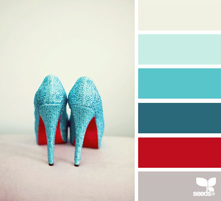
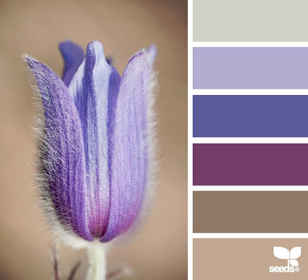
If you’re looking for inspiration, use this website http://design-seeds.com – they make up little swatches of colours from the most beautiful images (it’s worth checking it out just for the images alone!). New colour palettes are added nearly every day so you’ll be spoiled for choice.
If you go into the Advanced section of the design aspect of your blog, there are many colour options that you have to choose like background colour, main text body colour, links colour, links hover colour… it can all get very confusing. If you use too many of these colours from these palettes it probably won’t look like you have an actual scheme you’re sticking with, so choose one or two colours and use them consistently.
Or if you’re still stuck, or maybe a little overwhelmed by all the choices, do this: choose black and white and ONE colour only. You can’t go wrong with this (this is what I did with my blog design – black, white and hot pink). I’ve chosen the Pantone Colours of the Year from this year (Emerald) and the last few years as examples:
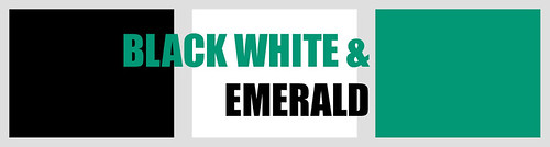
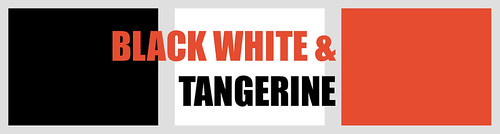
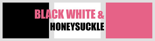
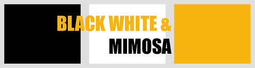
See how bold they look with black and white? Also, the text in black and the chosen colour over white show how a little uniformity makes the colour scheme immediately pulled together and punchy.
So that’s colour. Next…
2. Make all your images the same width
I honestly think this is so important to the overall look of your blog. Things like non-uniformity detract from the images themselves, and rather than noticing the image content (usually outfits), your eye is drawn to the fact that they zigzag down the page. It makes a much better impact design-wise and it makes it easier for the eye to “read” pictures. Your design will look sleeker and more professional – I guarantee it.
So this is how a post with different width photos would look:
How to make all your images the same width:
I’ll be honest – I’m going to cheat and insert a section on how to do this from my Photo Tips Friday: Clean Up, Resize, Optimize Your Photos post from October; if it ain’t broke, don’t fix it! I have edited this section somewhat, but do refer to the original if you want to read it in full.
…it’s simply a case of looking at your HTML coding and making sure your image widths are the same on every image – that’s it. But how do you do that?
In Blogger there are two ways to upload photos into your post – using the “insert image” button, or embedding the HTML code from Picasa, Flickr, Photobucket, etc. Both work absolutely fine and will allow you to upload nice large images. But, as far as I can tell, inserting an image directly does not give you the option of resizing to any exact pixels size. To see if your method of uploading images allows you set an exact width, insert an image in your usual way and take a look at the HTML code for it, as below:
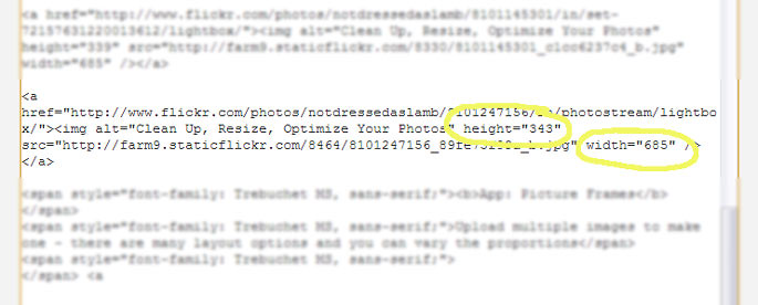
What you need to see is two measurements of height and width. If you don’t see these, you won’t be able to make all images exactly the same width.
The tricky bit (bear with me – it’s worth it!)
The only part that’s not so straightforward, which you may have realised already, is that if you change the width without proportionately changing the height, you will end up with either a very squashed photo or a very tall thin one. What you can’t avoid to amend this is a teensy bit of maths, I’m afraid! So I’ve broken it up into three easy steps:
1. Decide what your uniform image width is. Your blog format will have a set width for the blog posts, which can be increased or decreased, and ideally the images should completely fill that width without seeping over into the sidebar. My blog’s maximum image width is 685 pixels.
2. When I take the “large” image option from Flickr, the width of upright images (taller than they are wide) are thankfully all 685 if I haven’t cropped the picture. So it doesn’t matter what the height is, an upright picture will fit in perfectly… job done.
3. Landscape (wider than they are tall) images are the ones I always have to change, for example:
The dimensions are height 685 x width 1024 if I haven’t cropped the image or resized it in Photoshop.
The Maths Bit:
To make the width 685, the same as upright photos, I have to calculate Current width ÷ Desired width, or 1024 ÷ 685 = 1.49.
(So 1.49 is the magic Width Dividing Number (WDN) I have to remember).
Therefore I have to do the same with the height:
Current height ÷ WDN = Desired height, or
685 ÷ 1.49 = 459.
459 is now the new height for my landscape images.
Simply remember this: if I never, ever cropped pictures before uploading to my web album and they were either upright (height 1024 x width 685) or landscape (height 685 x width 1024), then I can leave upright ones as they are, and landscape will always have to be changed to height 459 x width 685. I don’t have to do the maths every time – the two dimensions are stuck on a Post-It note near my computer. It’s only if you’ve cropped or resized images that you have to do some more complicated maths; that’s for another post maybe…
… THIS IS THAT POST!
It’s more maths, I’m afraid. But if I use the above images as examples, I can show you how I calculate them all to the same size.
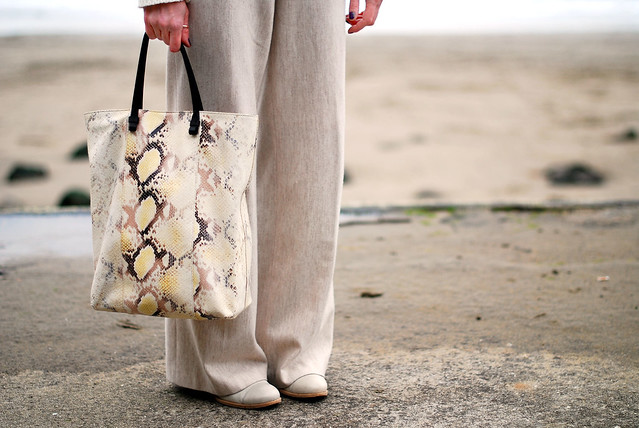
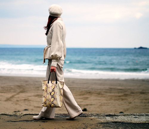
Image #1: Height 640 x Width 465
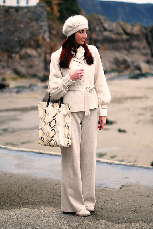
Image #2: Height 428 x Width 640
Image #3: Height 800 x Width 535
Image #4: Height 431 x Width 500
So you can see the widths are all different – I’ve got to proportionately resize them to the same width. The extra thing you have to do is use the calculation above for each image size.
Desired width for each image: 465 pixels (narrower for the benefit of this post – my pictures are usually 645 wide).
IMAGE #1 is the right width so I’ll leave that one.
IMAGE #2:
Current width ÷ Desired width = WDN
640 ÷ 465 = 1.37 (WDN)
So, Current height ÷ WDN, or 428 ÷ 1.37 = 312
Image # 2 now needs to be Height 312 x Width 465.
IMAGE #3:
Current width ÷ Desired width = WDN
535 ÷ 465 = 1.15 (WDN)
So, Current height ÷ WDN, or 800 ÷ 1.15 = 695
Image # 3 now needs to be Height 695 x Width 465.
IMAGE #4:
Current width ÷ Desired width = WDN
500 ÷ 465 = 1.07 (WDN)
So, Current height ÷ WDN, or 431 ÷ 1.07 = 402
Image # 4 now needs to be Height 402 x Width 465.
THAT’S THE BORING BIT OVER!!!
A few tips:
- Don’t try to make an image bigger. The quality will suffer as a result.
- Choose the maximum width possible for your photos according to your post body width (within reason). Don’t let the images overlap onto your side bars.
- Resize each image as you go along, not after you’ve inserted the HTML for all of them. You’ll get confused looking at a mass of characters, trying to work out which heights and widths go together.
So now look at the difference it makes to “reading” the image information when the photos are all the same width:

It’s much more fluid and easy on the eye – you don’t have to dart your eyes back and forth to take in wide, narrow, wide, narrow… you get the idea.
…………………………………………………………………………………………………………………………
Next time?
Probably the last of this series, in two weeks I’ll be covering Follow Buttons, Simplifying Everything, Getting Feedback, and (this is the big one) Transferring Your New Design from your test blog to your actual blog. Scary stuff.
Have a wonderful weekend everyone – I’ll have a new outfit post tomorrow for those that like seeing me in my togs 😉


These instructions of hight and width were sooooo handy to me. I had just read them when I started my own blog. And it helped me a lot. So thank you again.
hmm…what i do with my photos is subtract my ideal width by the actual width then add that difference to the height and i try to keep the photos not less than 1000px to make sure that resizing won't affect the picture. i'm not sure if it's the same thing 🙂 i'm very bad at numbers but the tip is very useful. I agree that uniformity in the size of the photos make a big difference in the overall look. I have never thought of using a test blog though. I think it makes a lot of sense and I think I should. What a brilliant segment this is, very helpful 🙂
Great post, Catherine.
For me the layout is as important as the photos and text.
I do work on the code but always adjust the size (and everything else) of my photos in Photoshop before I upload them. In blogger I just select "original" size and it's done.
Looking forward to your next series.
Annette
Lady of Style
Thank you so much for this series and sharing all your hard-earned knowledge. You've actually answered a lot of the questions I've wondered about (since I contacted you, OMG FOREVER ago) and some I never would have thought of! Thanks!
Minda
Great tips, thank you Catherine. I try to make my pictures the same width but not with 100% success. This is v. helpful. xoxoxo
Thanks for the tips! I use blogsy on my ipad and I believe you can adjust the height and width without messing the code. Can't wait for the other tips.
WhoisthatgirlMo
Fantastic tips, Catherine: I love the site with all the different colour swatches, what a great resource! I also really agree about photos being the same width: it seems like such a small thing, but it makes such a difference. I also have a "thing" about my photos being the same width as the content column – just keeps everything neat!
Great post, Catherine! Really interesting and useful, I love your how to guides!
Rena xoxo http://electricdress.blogspot.com
I totally agree about using the same photo widths. I need to implement this on my blog! It really looks so much cleaner. Thanks for the tips!